Minimal-UI-driven dungeon crawler
Recently I have been searching for a new game-mechanic idea, for a possible next hobby project. I've built a number of prototypes but nothing really convinced me yet - all the 'unique' approaches turned out not fun after a moment. What I have discovered though, is that more often than not, I've got annoyed by the game controls I've created. It was usually quite cumbersome and involved lots of unnecessary input clicks, ability or card switching etc.
I always keep in mind that I'd like to target mobile sooner or later, either by a responsive WASM or native build - so ideally the UI should be simple enough to be both keyboard and touch friendly.
Basic actions
In the end I have decided to try building a prototype where I start the design from the UI perspective. As I've always had a 2d coffee-break roguelike/lite in mind it naturally translated into four basic action mappings: WASD / ortho touch swipes (nothing revolutionary here). If those actions are context dependent, it is easily enough to handle all the movement, combat, door opening etc.
If the player presses 'D': move right if possible, if not: look for the NPC to attack, if not: check for door to open and so on.
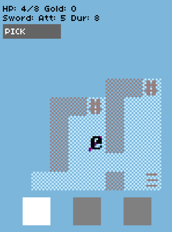
Later on I've got the need to perform some in-place actions as well: pick the item, climb the stairs and so on. Of course those actions could be performed automatically, while entering the specific tile, but I thought maybe that's too limiting. I've decided displaying a single context-aware action button would be an ok compromise - esp. that you wouldn't need to click it every turn.

Inventory
The last missing part of the UI was the inventory - which often plays a significant part in such games. For now, I chose to simplify the combat mechanics greatly - the player can only wield and carry offensive items (swords and such). This can result in a very basic UI, where there is only a single item :) However to make room for some future mechanics, I've decided that the player will be able to switch weapons and thus there are three possible slots (only one can be active though).
The main reason for that is a limited weapon durability, that would diminish with every attack. Therefore it might be beneficial to spare some bad-ass weapon and not waste it on weaker monsters. Also, it gives the possibility to carry different kinds like paralyzing wands and alternate those in combat, enabling some potentially interesting tactical choices. (It is obviously not fully developed yet, so time will show)

What's next?
I believe now those three main elements (cardinal directions, context button and item slots) make for a complete, minimalist UI. One that can be constantly visible on a single game screen. Most of the time, player's involvement should be limited to simply swiping / WASDing with an occasional need to press the popping button or switch the active weapon slot.
Will such a gameplay be interesting enough? I am not fully convinced yet, but I will give this prototype a chance and try to develop it at least a bit further :)